
What Buyers Want: Deal Demand by EBITDA Range
Understanding buyer demand plays a significant role for business owners and dealmakers when it comes to navigating lower middle market…
It’s common knowledge that every investment firm today should have a website (yes, that includes “under-the-radar” family offices). But of course a website alone isn’t enough. Your firm needs a good website: sophisticated, detailed, informative, easy to navigate, mobile responsive, etc.
In addition to general design principles, investment firms should keep in mind these three simple (but often overlooked) must-haves.
“Is your firm a good fit for my business?” If sellers and their advisors can’t answer this question with a high degree of certainty after visiting your website, it has failed arguably its most important purpose.
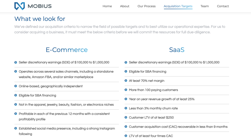
Look to search fund Mobius Holdings’s website for an exceptional example of conveying investment criteria clearly and specifically. Mobius specifies its two areas of investment interest upfront and provides detailed bullet points for each.
Show, don’t tell. This high school English teacher staple is just as applicable to website design as it was to your term paper on To Kill a Mockingbird (go figure). Your portfolio companies provide a tangible representation to advisors and sellers of your philosophy, sector focus, and success.
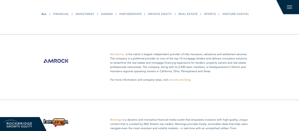
Rockbridge Growth Equity provides a great model here. The firm’s site succinctly introduces how they think about the companies they invest in and then features a scrolling list of these companies and a brief description of each.
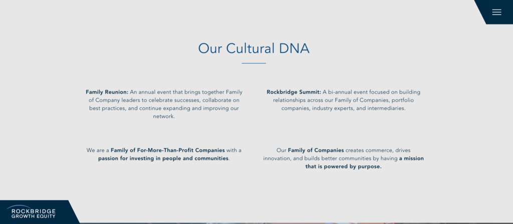
The list is also filterable by industry, which is a nice touch.
We also love how High Road Capital makes the portfolio company personal by featuring quick quotes from CEOs on how High Road helped their company. It may seem simple, but such a feature speaks volumes to potential sellers about the firm’s ethos.

If we had a penny for every website we scoured and came away from without a clue whether the firm was a family office, a PE firm with a dedicated fund, an independent sponsor, or something else entirely… let’s just say we could invest in some good companies of our own.
At the risk of stating the obvious, advisors and sellers want to know where your money comes from (and what form it takes). While giving them this information, you can also take the opportunity to differentiate yourself by describing how your model sets you apart and how it benefits sellers.
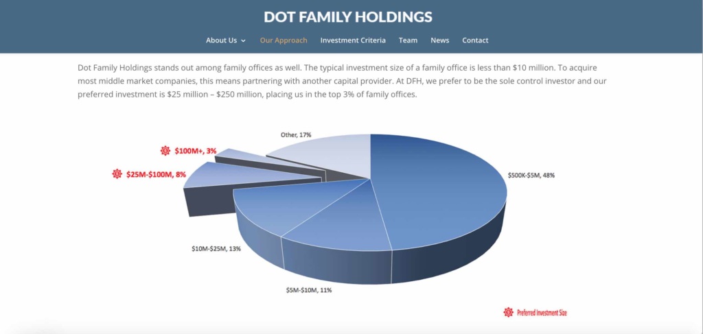
Take DOT Family Holdings. Lots of firms may claim “not all capital is created equal,” but this family office’s website illustrates what they mean by this claim with an easy-to-scan pie chart showing both their preferred investment size and how this sets them apart from most other family offices.
For more insight into website design, read our article on what makes a great private equity website, with tips from PE-focused design agencies.
