The Private Equity Deal Sourcing Playbook
What This Playbook Delivers This is your insider guide to modern private equity deal sourcing: what top-quartile firms do differently,…
In an increasingly competitive M&A environment, marketing your private equity firm online is a non-negotiable. Relationships are still important, but a static Rolodex of banker contacts no longer cuts it when it comes to business development. With more PE firms than ever and a highly fragmented intermediary landscape, proprietary deal flow is an increasing rarity. Private equity firms need to be proactive about telling their story effectively online to increase discoverability and drum up deal flow from business owners and intermediaries alike.
“Everyone is so used to interacting with consumer websites; they’ve come to expect the same from every type of business, and that includes private equity. A founder or operator looking for an exit or PE investor will go straight to a private equity company’s website online and judge them on that basis,” says Jonathan Sluys, Partner and Creative Director at Breakout Studio, a creative agency with a unique focus on financial services.
We talked to Sluys about his top tips for creating an effective website, along with 5 elements every site should include.
1. Don’t take the easy way out. Focus on your brand and how best to portray it.
With increasing pressure to develop a comprehensive marketing strategy, “firms often want to jump to the endgame,” says Sluys. “They feel pressure to just take a static Wordpress template and turn it into a website.”
But, he cautions, creating an effective site isn’t just about passable design. Rather, it’s about authentic brand expression. For private equity, that means effectively portraying everything from the type of investments firms make, to how they partner with business owners and operators and ultimately define a successful investment.
“It’s important to spend time on who your audience is and why you’re creating this site in the first place. For example, a lot of firms come to us because they feel like they’re seeing a lot of deals, but they’re all coming through intermediaries. And they’re frantically looking for good deals that can be sourced themselves. In this case, their primary audience is potential business owners.” These owners are accustomed to compelling consumer websites, and will expect a similar level of polish from your firm’s site.
2. Go beyond buzzwords.
A crucial component of effective brand expression on a website should emphasize what makes your firm distinct from the competition, says Sluys. “This again becomes a process of defining your firm’s brand — it’s an exercise that not all firms have been through before. But once they do go through the process, it really makes a difference in their business development.”
Sluys says many firms often initially come to him with similar differentiators: a long-term investment strategy; great relationships; a focus on more than just financials. “After working with many firms over the years, we’re able to say to them, ‘Yes, all that is great, but these are claims that nearly every other firm is making. They’re becoming table stakes.’”
Sluys urges his clients to go deeper by leading them through a series of brand-defining exercises which include interviews with partners and employees at all levels of the firm, as well as executives and employees at portfolio companies. “We ask everyone a set of questions around how it is to work there, or work with them, and what they think makes them great. We use their answers to form the basis of a really compelling, unique brand narrative. What we are trying to define is what truly motivates the firm, why they exist, and how that makes them different.”
Conveying a firm’s culture online can be difficult. “You can’t just write ‘we have a great culture’ on a website and expect people to believe you,” says Sluys. “You can begin to get this across through your tone of voice and the visual branding on your website. But culture also goes beyond your website — it’s reflected in how you conduct yourself in meetings and how your office functions. Our job is to help clients find ways to subtly reflect that culture online.”

3. Don’t bite off more than you can chew.
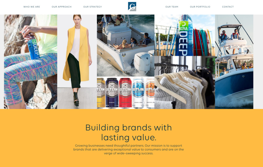
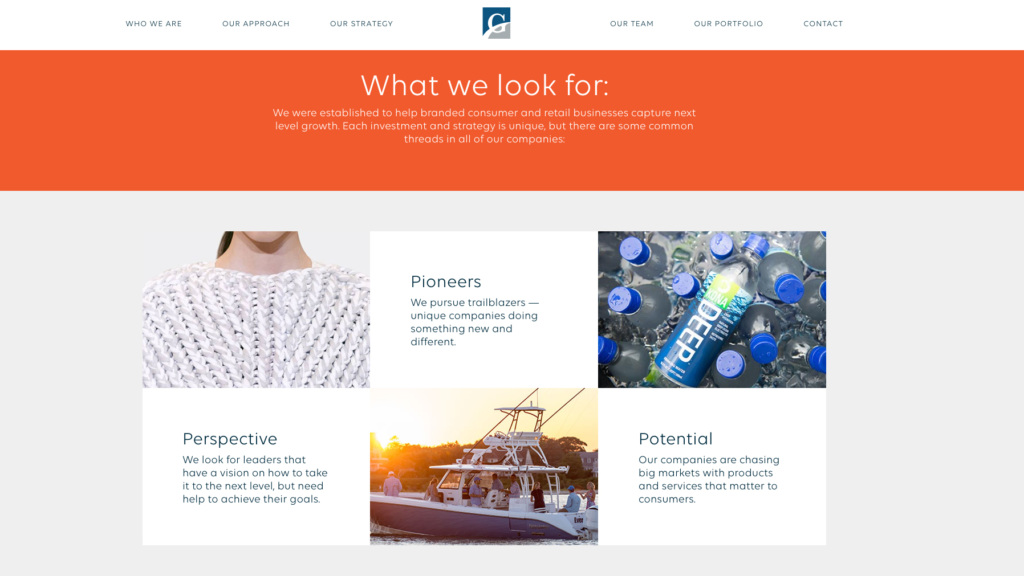
If you’re a small firm, don’t feel like you have to create a multi-page website or update your blog daily with new content. For example, Breakout Studio recently worked with Grand Crossing Capital to redesign their site. “Their site, when we started working with them, was a single page site — and we kept it that way, merely adding more components reflecting their focus on investing in consumer businesses.”
They kept the site manageable, while changing almost everything else about it. A dark color scheme became brighter and inviting, with high-quality photography from their portfolio companies (mainly consumer brands). They also made the site copy more inspiring and friendly, in order to highlight the firm’s consumer focus.

While every PE firm website will be different, there are a few components that Sluys recommends for almost every firm. These include:
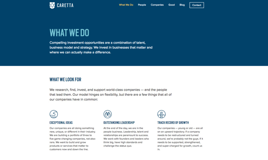
“We make sure that a firm’s investment criteria is on any site we create. This section is primarily for intermediaries, who — while not always the primary focus — are still an important audience for firms.” This section is often the same place firms convey their unique value-add and approach.

Sluys recommends including photos, short biographies, and contact info, but cautions that there’s no need to go overboard. “Sometimes when we read through websites, we see really blown out team pages with giant bios and lots of information. We tend to try and scale that back. But you do want to make it easy to find people and get in touch.”
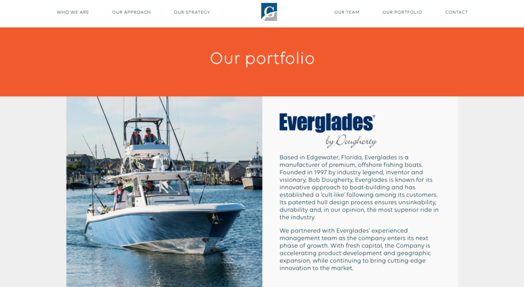
There are a few different ways to approach this section. Some firms list all their portfolio companies dating back to the firm’s founding, while others focus more broadly on their investment strategies and include a few illustrative examples.


This can be a separate page or a section in your footer, but should provide an easy way for interested parties to find your firm’s address, phone number, and general email address.
“If you’re going to have a website today, it needs to function on mobile,” says Sluys. “A lot of companies may have put up a site years ago, and it may not function or be very difficult to use on a phone. Sometimes our clients don’t realize how important it is for someone to be able to pull up their site on the go.”
Bonus: News section/blog
“Not every firm needs a news section, but having one is a great place to highlight any industry coverage your firm gets,” says Sluys. For bigger firms, a blog is a great place to publish thought leadership and execute on a content marketing strategy.
